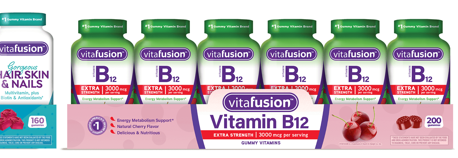
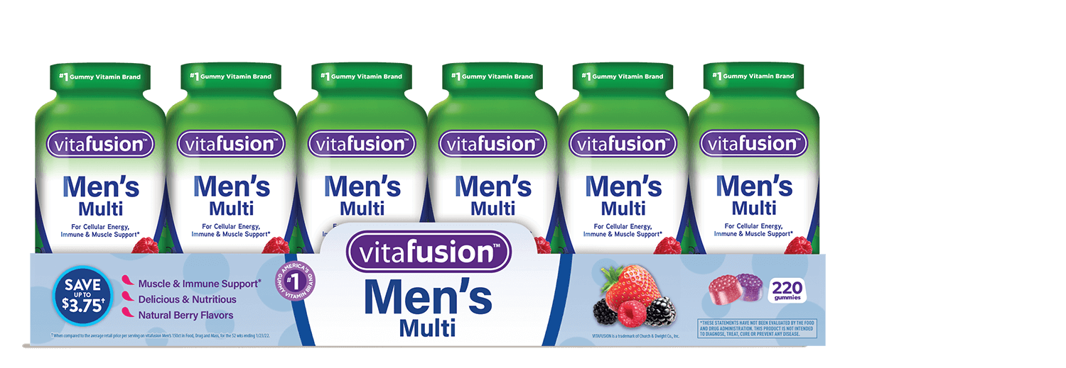
L'il Critters & Vitafusion Packaging, print Ads & in-store Displays
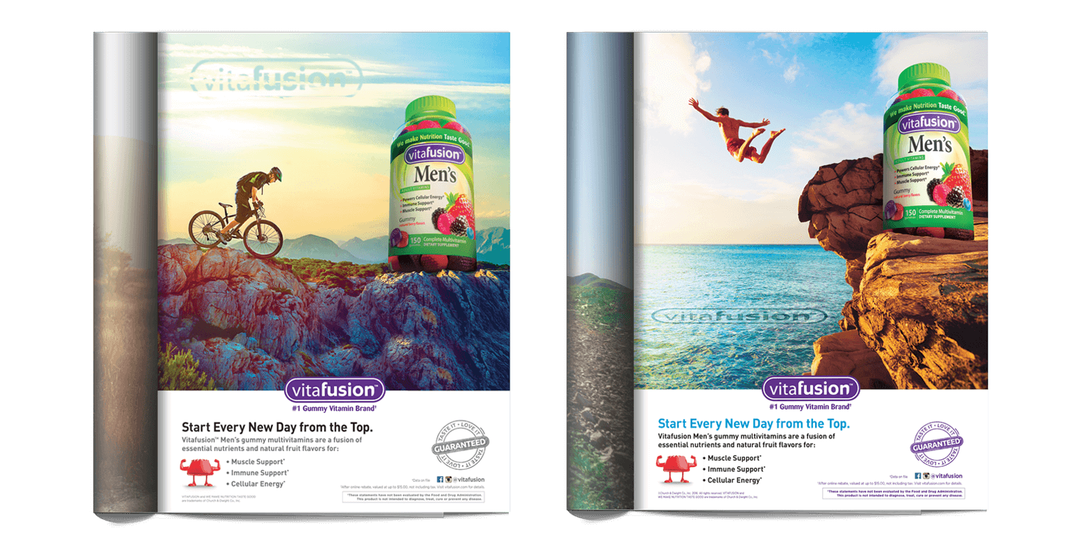
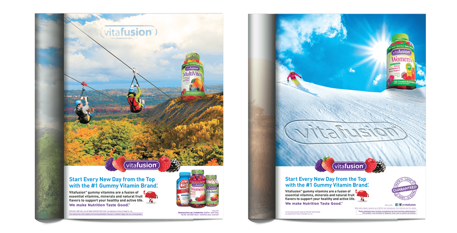
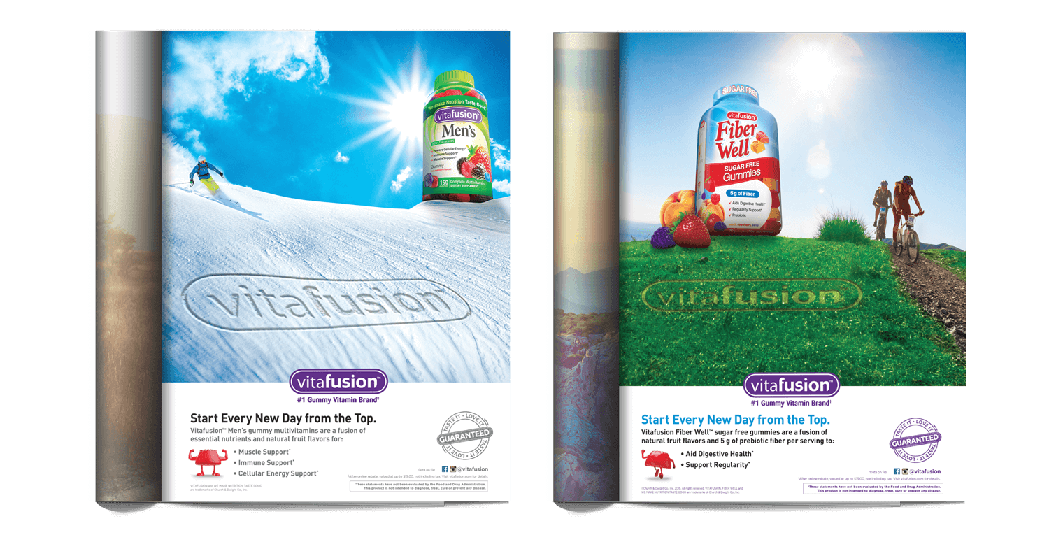
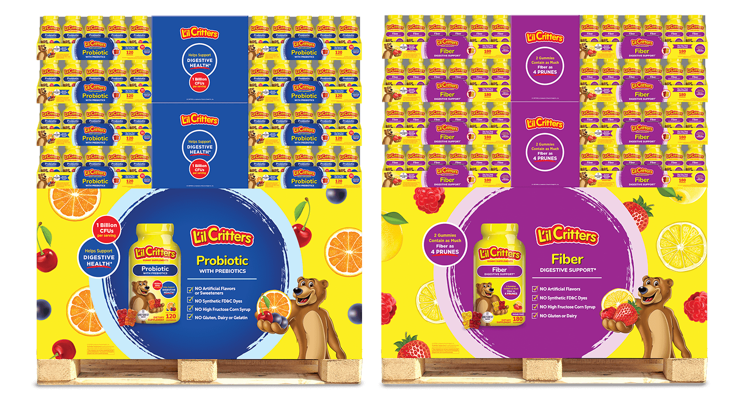
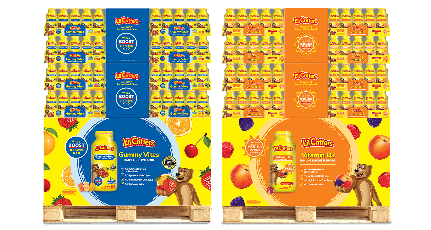
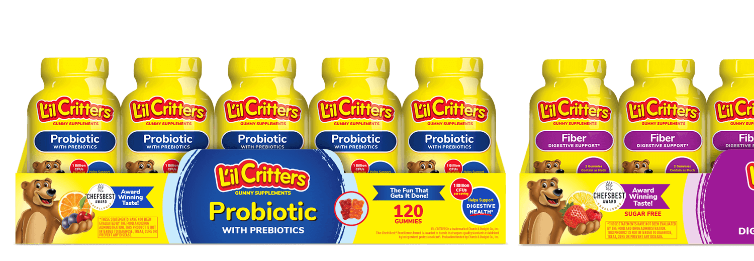
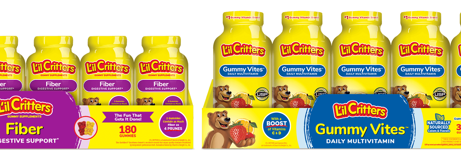
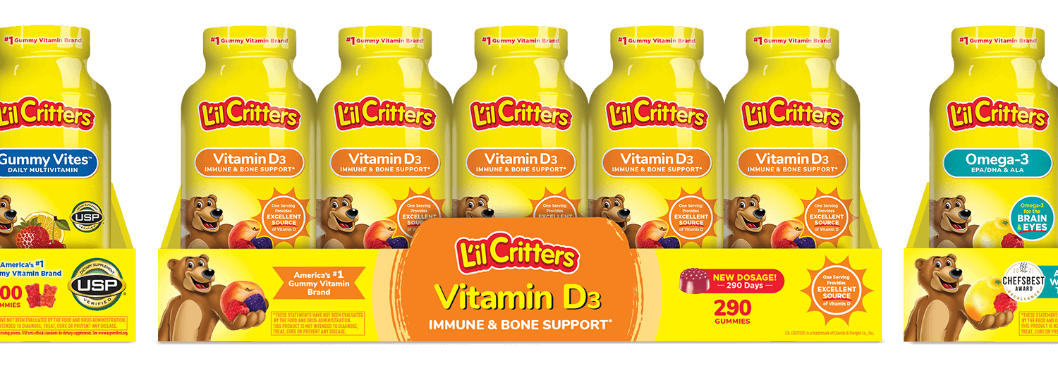
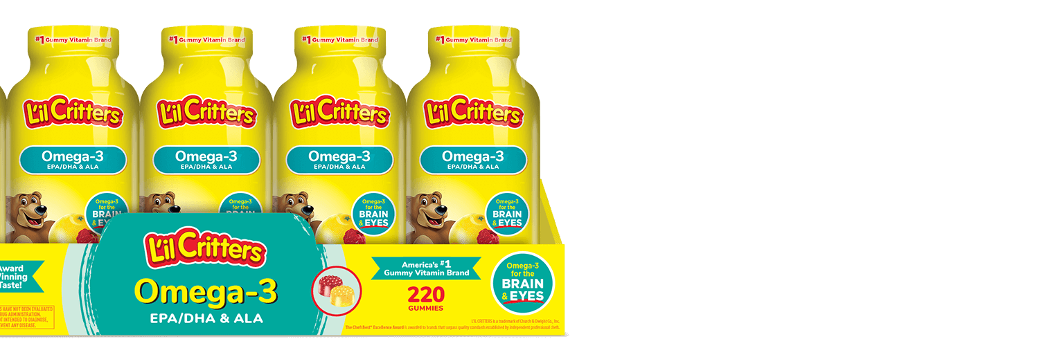
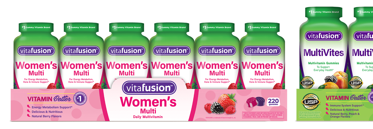
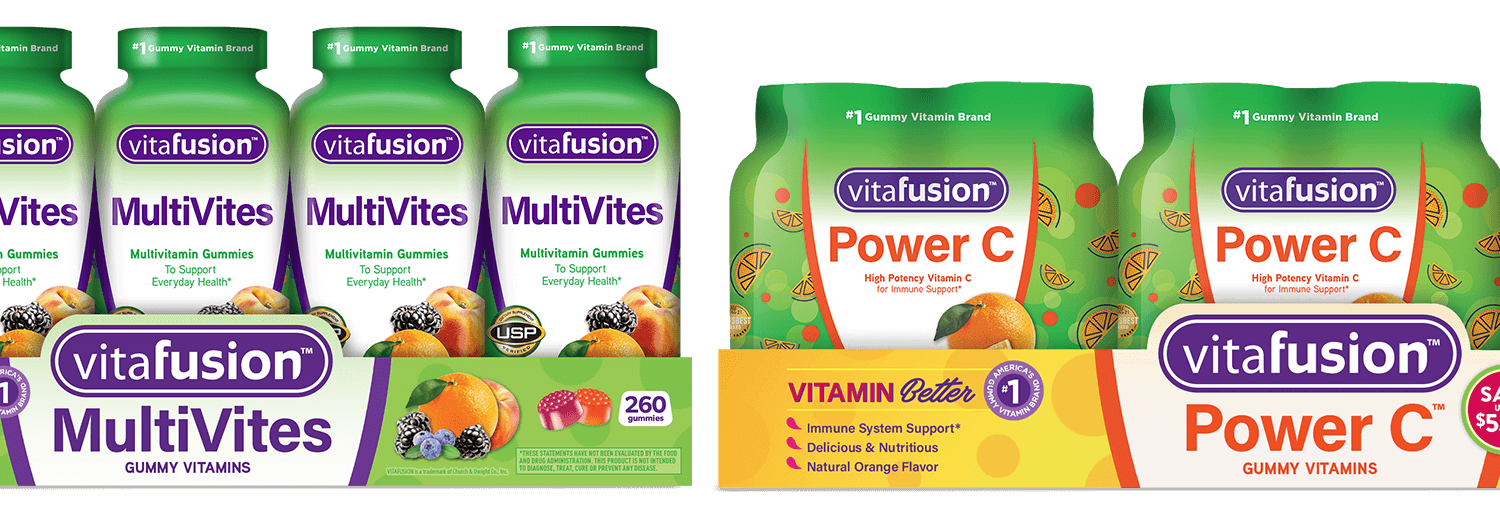
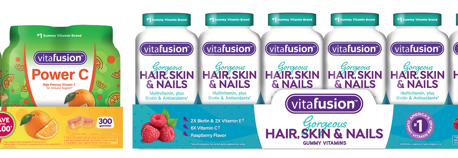
A collection of various shrink label designs, in-store displays and print ads created for Vitafusion and L'il Critters Gummy Vitamins. The Vitafusion and L’il Critters club tray and base designs were named “the gold standard” by Costco for what other brands should work towards when creating their own display designs. The bright color blocking of the trays and pallets stood out at off at shelf and helped differentiate the variety of skus within the brand.
For the Vitafusion redesign, we worked with the client’s above the line agency to blow out the new look and feel in a full line of Vitafusion gummies for FDM and club stores, including line extensions like their line of beauty gummies. The client wanted the beauty line to have it’s own look and feel, but still tie it into the overall structure of the Vitafusion line.
Throughout this process, we worked with the clients continuously to develop new skus for retailer meetings and sell-ins and help meet the needs and requests of each individual retailer. We continuously strived to help the client maintain brand consistency through out all of their different display programs at different stores.
We were also tasked with redesigning LC’s Natural Channel line called “Rhino”. The goal was to create a more fun and modern look and feel while maintaining the well-known yellow brand block. The client also wanted to move away from the name and imagery of the Rhino. Our solution was a more fruit forward and fun approach to entice buyers at the Natural Channel shelf.
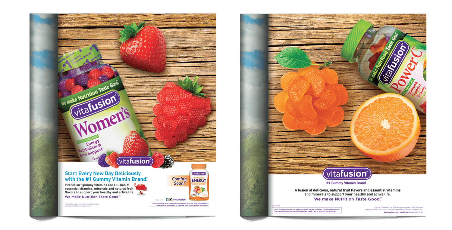
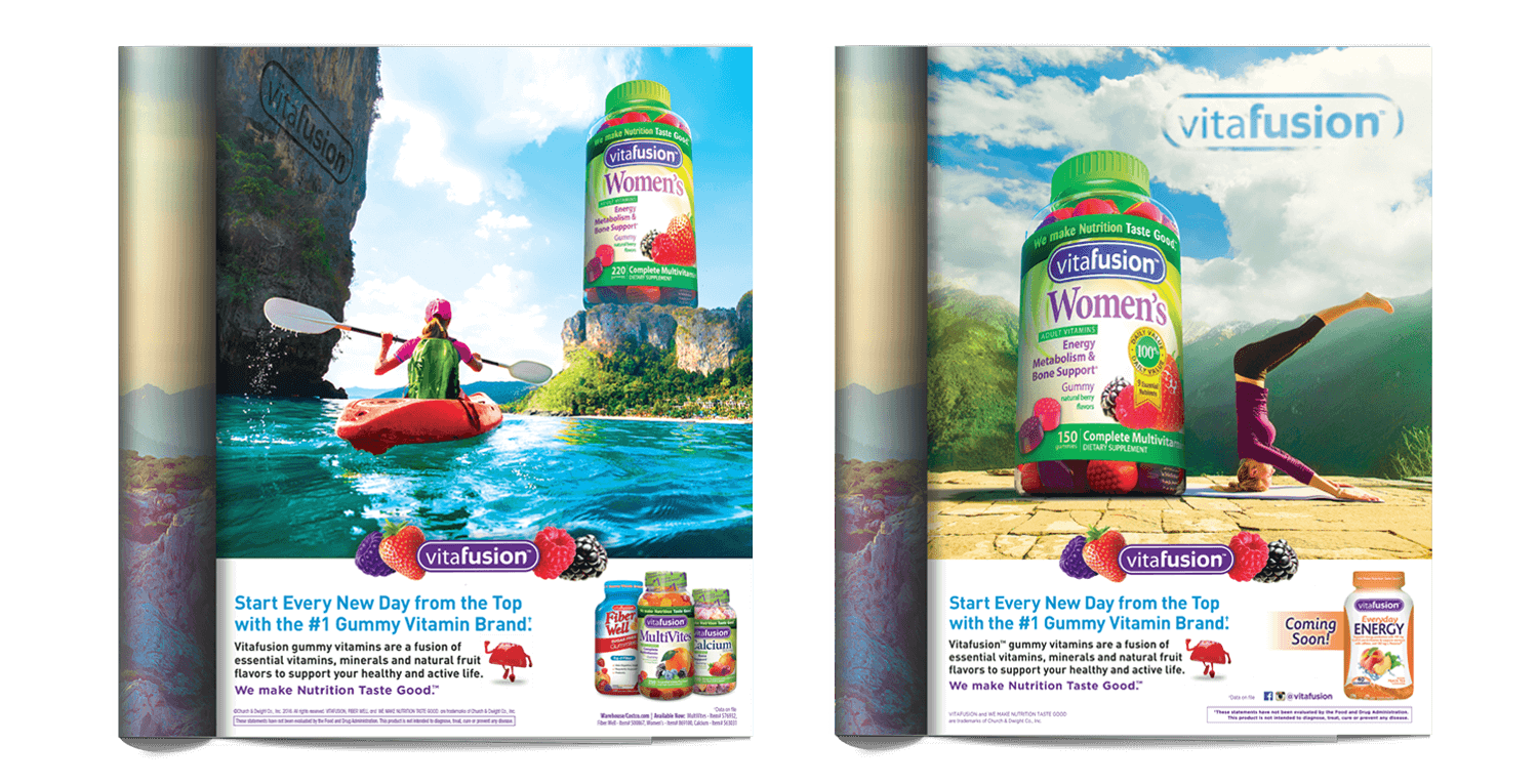
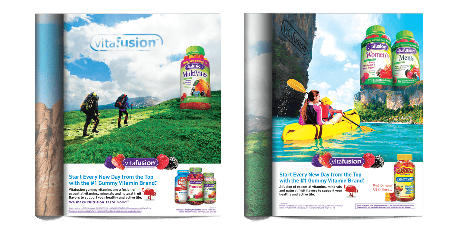
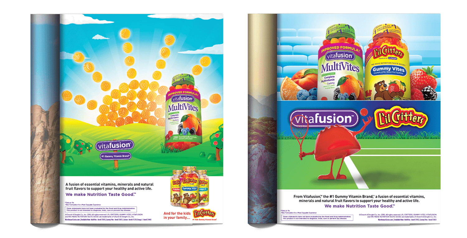
A collection of print ads from Vitafusion and L'il Critters' "Start Every Day from the Top" campaign.
